[ 살펴보기 ] RadixUI - Themes
![[ 살펴보기 ] RadixUI - Themes](https://cdn.hashnode.com/res/hashnode/image/upload/v1730962026062/63e9db33-3c2e-4e40-9bc2-044c3f4f9802.jpeg)
RadixUI Primitives과는 달리 RadixUI theme은 Radix primitives을 기반으로한 styled component를 제공한다. Radix theme이 제공하는 component와 configuration 방법을 살펴보자. 편의상 일부 예제는 tailwindcss가 함께 적용되어 있으며 tailwindcss는 Radix theme과 별개임을 주의하자.
우선 Radix theme을 사용하기 위해 다음 package를 설치한다.
npm install @radix-ui/themes
그리고 application의 main file에 다음 css file을 import 해준다. 예를 들어 Vite 기반의 project라면 application root 역할을 하는 main.tsx file에 import하거나 NextJS 기반의 project라면 root level의 layout.tsx 파일에서 import한다.
src/main.tsx
import "@radix-ui/themes/styles.css";
...

createRoot(document.getElementById("root")!).render(
  <StrictMode>
      <App />
  </StrictMode>
);
그리고 다음과 같이 root component를 Theme으로 wrapping 해준다.
import "@radix-ui/themes/styles.css";
import { Theme } from "@radix-ui/themes";
...

createRoot(document.getElementById("root")!).render(
  <StrictMode>
    <Theme>
      <App />
    </Theme>
  </StrictMode>
);
위의 작업이 끝났다면 이제 원하는 곳에서 radix theme이 제공하는 component를 사용할 수 있다.
import "./App.css";
import { Button, Flex, Text } from "@radix-ui/themes";

const App = () => {
  return (
    <Flex direction="row" align="center">
      <Text>Hello, World</Text>
      <Button>Hello, Button</Button>
    </Flex>
  );
}

export default App;
Layout
Radix theme은 layout component로 다음 다섯 가지 component를 제공한다.
Box : display:block 속성을 가진 기본 box를 제공한다. default로 div element로 render되며 as property를 통해 render되는 element를 div 또는 span로 설정할 수 있다.
  ...
  import { Box, Text } from "@radix-ui/themes";

  const App = () => {
    return (
      <Box as="span">
        <Text>Test</Text>
      </Box>
    );
  };

  export default App;
Flex : display:flex 속성을 가진 flex box를 제공한다.
align, direction, gap등과 같은 property를 통해 flex box에 필요한 설정을 전달할 수 있다.... import { Flex, Text } from "@radix-ui/themes"; const App = () => { return ( <Flex direction="row" gapX="4"> <Text>Test</Text> <Text>Test 2</Text> </Flex> ); }; export default App;Grid : display:grid 속성의 grid box를 제공한다.
columns, gap, rows등과 같은 property를 통해 grid box에 필요한 설정을 전달할 수 있다.... import { Box, Grid } from "@radix-ui/themes"; const App = () => { return ( <Grid columns="3" gap="3" rows="repeat(2, 40px)" width="600px"> <Box className="bg-green-300" /> <Box className="bg-green-300" /> <Box className="bg-green-300" /> <Box className="bg-green-300" /> <Box className="bg-green-300" /> <Box className="bg-green-300" /> <Box className="bg-green-300" /> </Grid> ); }; export default App;Container : Container component의 children이 차지할 수 있는 max-width를 제한한다. Container component에 설정한 size는 내부적으로
rt-ContainerInnerclass를 가진 element에 적용된다.... import { Box, Container} from "@radix-ui/themes"; const App = () => { return ( <Container size="1"> <Box className="h-20 bg-green-300" /> </Container> ); }; export default App;Container component에 설정할 수 있는 size는 다음과 같다.
  size="1" // 448px
  size="2" // 688px
  size="3" // 880px
  size="4" // 1136px
Section : section html element로 render되는 container를 제공한다. size property의 설정 값에 따라 component의 padding 값이 달라진다.
  ...
  import { Box, Section } from "@radix-ui/themes";

  const App = () => {
    return (
      <Section size="1">
        <Box className="h-20 bg-green-300" />
      </Section>
    );
  };

  export default App;
Typography
Radix theme은 text element를 위해 사용할 수 있는 여러가지 component를 제공한다. 모든 typography component는 documentation을 통해 확인할 수 있으며 그 중 일부를 살펴보자.
( Reference - Typography )
Text : span element로 render되는 기본적인 text component다. as property를 통해
span, div, label, pelement로 render할 수 있으며size, trim, truncate와 같은 property를 통해 text와 관련된 설정을 할 수 있다.... import { Flex, Text } from "@radix-ui/themes"; const App = () => { return ( <Flex direction="column" gapY="5"> <Text as="p" mb="5" size="3"> Lorem Ipsum is simply dummy text of the printing and typesetting industry. Lorem Ipsum has been the industry's standard dummy text ever since the 1500s, when an unknown printer took a galley of type and scrambled it to make a type specimen book. It has survived not only five centuries, but also the leap into electronic typesetting, remaining essentially unchanged. </Text> <Text as="p" mb="5" size="2"> Lorem Ipsum is simply dummy text of the printing and typesetting industry. Lorem Ipsum has been the industry's standard dummy text ever since the 1500s, when an unknown printer took a galley of type and scrambled it to make a type specimen book. It has survived not only five centuries, but also the leap into electronic typesetting, remaining essentially unchanged. </Text> </Flex> ); }; export default App;Heading :
h1, h2와 같은 heading element로 render되는 component다. as property를 통해 특정h1 ~ h6중 어떤 element로 render할 것인지 설정할 수 있다. 마찬가지로size, trim, truncate와 같은 property를 통해 text와 관련된 설정을 할 수 있다.... import { Heading, Flex } from "@radix-ui/themes"; const App = () => { return ( <Flex direction="column" gapY="5"> <Heading as="h2" mb="5" size="5"> The goal of typography is to relate font size, line height, and line width in a proportional way that maximizes beauty and makes reading easier and more pleasant. </Heading> <Heading as="h3" mb="5" size="3"> The goal of typography is to relate font size, line height, and line width in a proportional way that maximizes beauty and makes reading easier and more pleasant. </Heading> </Flex> ); }; export default App;Code : code element로 render되는 component이며 variant, color등의 property를 통해 style을 적용할 수 있다.
  ...
  import { Code, Flex } from "@radix-ui/themes";

  const App = () => {
    return (
      <Flex direction="column" gapY="5">
        <Code variant="solid" color="indigo">
          console.log()
        </Code>
        <Code variant="soft" color="cyan">
          console.log()
        </Code>
      </Flex>
    );
  };

  export default App;
Radix theme은 application main component를 wrapping하는 <Theme> component를 통해 default theme setting을 설정한다. Theme에 설정할 수 있는 설정 값은 여러가지가 있지만 그 중 일부를 살펴보자. Theme을 통해 설정할 수 있는 상세 사항은 documentation에서 확인할 수 있다. ( Reference - Theme )
Theme - Color
Radix theme의 default theme color는 Radix colors를 기반으로 여러가지 accents color를 제공하며 사용할 수 있는 accents color는 다음과 같다. ( Reference - Available accent colors )
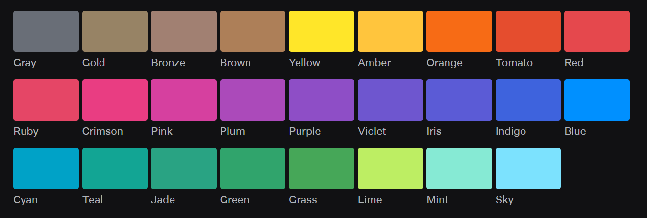
만약 theme의 accent color를 cyan으로 변경하고 싶다면 다음과 같이 Theme comoponent의 accentColor property를 변경해준다.
...

createRoot(document.getElementById("root")!).render(
  <StrictMode>
    <Theme accentColor="cyan">
      <App />
    </Theme>
  </StrictMode>
);
그러면 다음과 같이 button component를 사용할 때 적용되는 color가 accentColor에 설정한 color 기준으로 적용되는 것을 확인할 수 있다.
import { Badge, Button, Flex } from "@radix-ui/themes";

const App = () => {
  return (
    <Flex direction="column" gapY="5">
      <Button>Check</Button>
    </Flex>
  );
};

export default App;

RadixUI에서 사용할 수 있는 모든 accent color는 각각 12개의 세부scale로 나뉘어지며 다음과 같이 --accent-1 ~ --accent-12범위의 css variable을 통해 accent color scale 값을 사용할 수 있다.
.test {
  color: var(--accent-3);
}
또는 특정 color의 scale 값을 바로 사용하기 위해선 다음과 같이 accent color 이름을 바로 사용해 사용할 수 있다.
.test {
  color: var(--cyan-3);
}
RadixUI에서 제공하는 color의 scales은 모두 다음과 같이 alpha variant를 가진다.
.test {
  color: var(--cyan-5);
  background-color: var(--cyan-a2);
}
import { Flex, Text } from "@radix-ui/themes";

const App = () => {
  return (
    <Flex direction="column" gapY="5">
      <Text className="test" size="5" weight="bold">
        Test
      </Text>
    </Flex>
  );
};

export default App;
만약 Theme component의 accentColor가 cyan으로 설정되어 있다면 위의 예제에서 Text component의 color는 cyan theme color의 범위 중 scale 3에 해당되는 color가 적용된다.
같은 component일지라도 variant property에 설정한 값에 따라 적용되는 scale color가 다르다.
...
import { Button, Flex } from "@radix-ui/themes";

const App = () => {
  return (
    <Flex direction="column" gapY="5">
      <Button variant="solid">Check</Button>
      <Button variant="soft">Check</Button>
      <Button variant="surface">Check</Button>
    </Flex>
  );
};

export default App;

만약 Radix theme에서 제공하는 theme color를 override하고 싶다면 다음과 같이 Radix theme의 css variable을 override하면 된다. 만약 cyan의 11 scale color를 #ff8000로 변경하고 싶다고 가정해보자.
.radix-themes {
  --cyan-11: #ff8000;
  --cyan-a11: #ff8000;
}

.test {
  color: var(--cyan-11);
}
위의 예제와 같이 radix-theme class에 override하고 싶은 color의 variable과 새로운 color값을 설정해준다.
import { Flex, Text } from "@radix-ui/themes";

const App = () => {
  return (
    <Flex direction="column" gapY="5">
      <Text className="test">Test</Text>
    </Flex>
  );
};

export default App;
그러면 다음과 같이 원래 cyan 계열의 color가 아닌 custom으로 설정한 color가 적용되는 것을 확인할 수 있다.

위의 예제와 같이 theme color를 override하는 css file를 사용한다면 Radix theme css file을 먼저 import 한 다음 해당 css file을 import 해준다.
import "@radix-ui/themes/styles.css";
import "./index.css"; // theme color override css 파일

...
![[ 살펴보기 ] RDB - Relationships](https://cdn.hashnode.com/res/hashnode/image/upload/v1739711556668/48dc9e84-a621-42aa-9c9f-5fc5c436f0ec.jpeg)
![[ 살펴보기 ] MySQL - Data types](https://cdn.hashnode.com/res/hashnode/image/upload/v1739593589113/530f8704-4d27-42c9-a451-bb5c63150b99.jpeg)
![[ 살펴보기 ] TypeORM - Transactions, Migration](https://cdn.hashnode.com/res/hashnode/image/upload/v1739106042581/980b8133-61d4-406a-a026-65be9c28eace.jpeg)
![[ 살펴보기 ] TypeORM - Relations](https://cdn.hashnode.com/res/hashnode/image/upload/v1738666874402/b688bd0b-b6bb-4f43-87d8-c1b46b59f1b7.jpeg)
![[ 살펴보기 ] TypeORM - Basics](https://cdn.hashnode.com/res/hashnode/image/upload/v1738666803591/bef5df17-7dc7-4123-ae55-004d5042df39.jpeg)