[ 살펴보기 ] Storybook - Addons
![[ 살펴보기 ] Storybook - Addons](https://cdn.hashnode.com/res/hashnode/image/upload/v1727360645448/d87ed39b-f395-4de2-b1f4-7c12f1d5565d.jpeg)
Storybook은 addon을 통해 여러가지 기능을 제공한다. 이번 포스트에선 Storybook이 default로 사용하는 중요 addons을 살펴보자.
Actions
Component의 click이나 mouseover등 event가 호출 되었을 때 해당 event에 대한 event handler가 있다면 해당 event handler가 호출 되었을 때 전달받은 parameter를 조회할 때 사용할 수 있다.
다음 예제를 살펴보자.
 import { ButtonProps, Button as MuiButton } from "@mui/material";
import React, { PropsWithChildren } from "react";

export type ButtonCompProps = {
  onButtonClick?: (address: string) => void;
} & Pick<ButtonProps, "variant" | "size"> &
  PropsWithChildren;

const Button = ({
  children = "Test",
  variant,
  onButtonClick,
  ...props
}: ButtonCompProps) => {
  const handleTest = () => {
    if(onButtonClick) return;
    onButtonClick(variant ?? "");
  };
  return (
    <MuiButton variant={variant} onClick={handleTest} {...props}>
      {children}
    </MuiButton>
  );
};

export default Button;
위의 Button component는 onclick event가 발생하면 handleTest function이 실행되고 handleTest function은 prop으로 전달받은 onButtonClick function을 실행한다. 그리고 onButtonClick을 실행할 때 prop으로 전달받은 variant를 parameter로 전달해준다.
이제 button story에 action을 추가해보자. button action을 spy하기 위해 @storybook/test에서 제공하는 fn utility함수를 사용한다.
import { fn } from "@storybook/test";

...

export const Contained: Story = {
  args: {
    variant: "contained",
    onButtonClick: fn(),
  },
};

export const Outlined: Story = {
  args: {
    variant: "outlined",
    onButtonClick: fn(),
  },
};
이제 실제 storybook에서 버튼을 click하거나 play function을 통해 click event를 발생시켜 보면 아래 action tab에서 onButtonClick이 전달받은 parameter 정보를 확인할 수 있다.
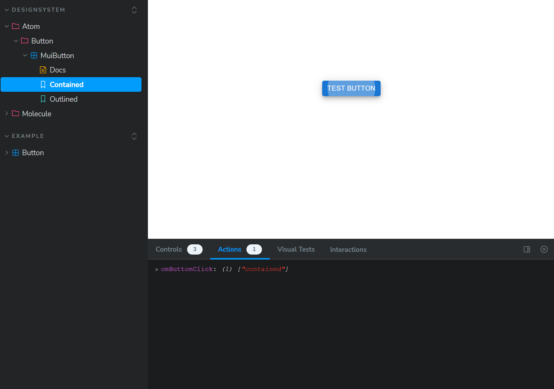
위의 예제에서 variant가 contained인 button story를 통해 테스트 했으므로 action에 보이는 onButtonClick parameter 정보는 “contained”이다.
물론 같은 파일에 정의되어 있는 모든 story에 action을 적용하고자 한다면 defalt meta object에 추가해도 무관하다.
import type { Meta, StoryObj } from "@storybook/react";
import Button from "./Button";
import { fn } from "@storybook/test";

const meta = {
  ...
  args: {
    ...
    onButtonClick: fn(),
  },
} satisfies Meta<typeof Button>;

export default meta;

type Story = StoryObj<typeof meta>;

export const Contained: Story = {
  args: {
    variant: "contained",
  },
};

export const Outlined: Story = {
  args: {
    variant: "outlined",
  },
};
Backgrounds
Background addon은 storybook에서 각 story를 확인할 때 story가 보이는 화면의 background color를 변경할 수 있게 해준다. Default로 dark와 light를 제공하며 원하는 색상의 options을 설정할 수도 있다.
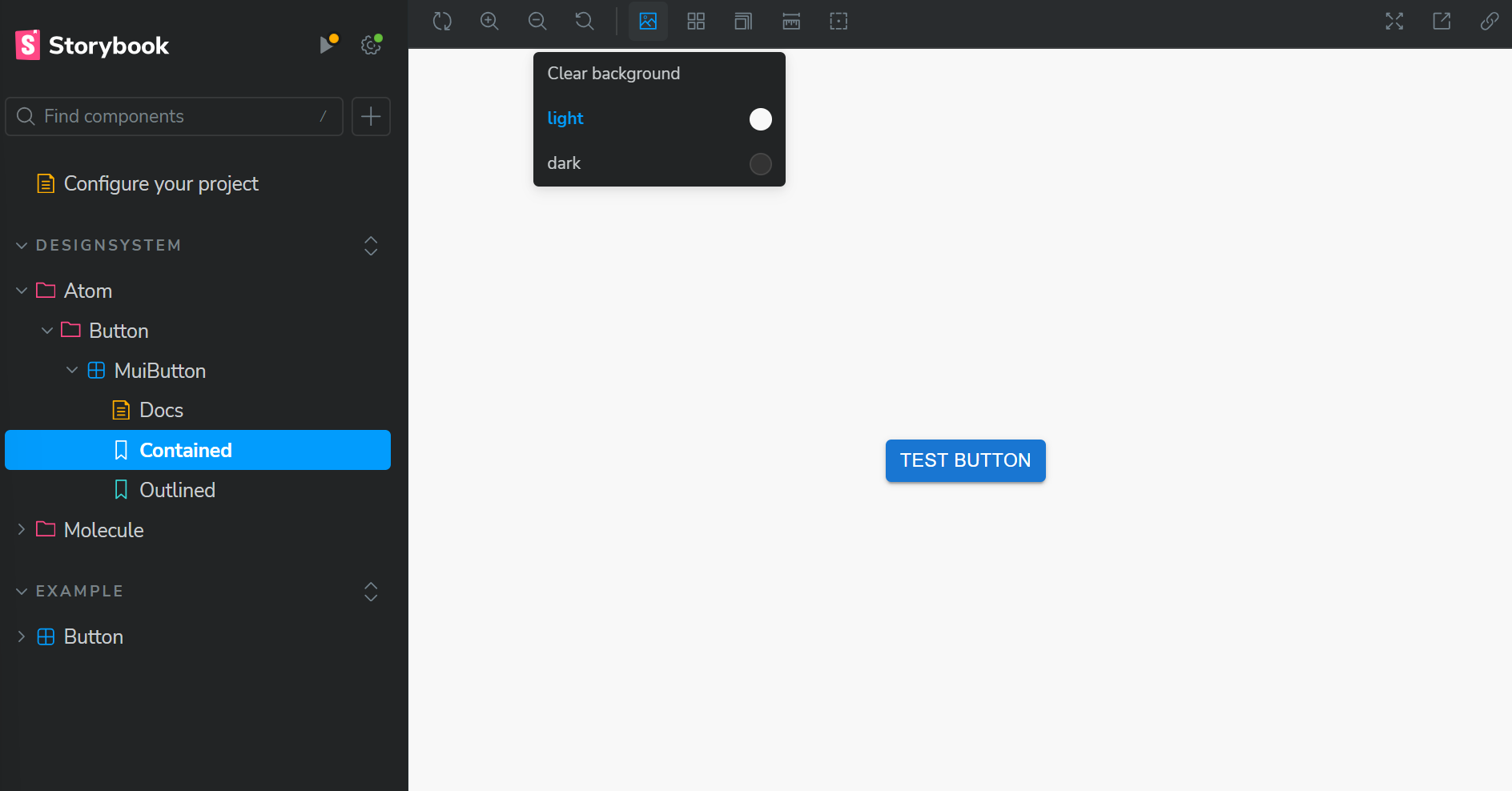
만약 custom 색상을 추가하고 싶다면 .storybook/preview.ts 파일에서 paramters.backgrounds를 통해 추가할 수 있다.
import type { Preview } from "@storybook/react";

const preview: Preview = {
  parameters: {
    ...
    backgrounds: {
      default: "light",
      values: [
        { name: "dark", value: "#333" },
        { name: "light", value: "#F7F9F2" },
        { name: "primary", value: "#90caf9" },
      ],
    },
  },
};

export default preview;
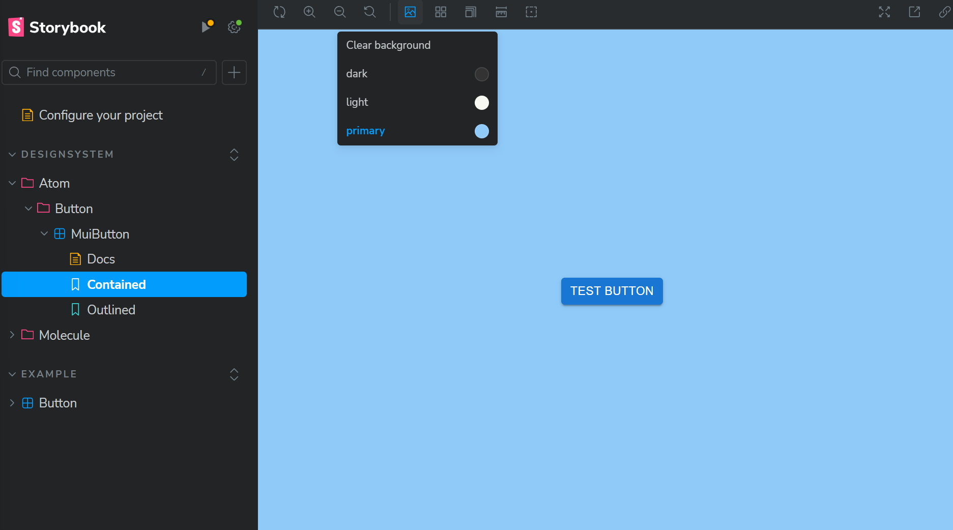
만약 .storybook.main 파일에서 feature.backgroundStoryGlobals option을 true로 설정하여 사용하고 있다면 parameters.backgrounds.options을 통해 color opiotns을 추가해야 한다. 그리고 default color는 initialGlobals.backgrounds를 통해 설정한다.
import type { Preview } from "@storybook/react";

const preview: Preview = {
  parameters: {
    ...
    backgrounds: {
      options: {
        dark: { name: "dark", value: "#333" },
        light: { name: "light", value: "#F7F9F2" },
        primary: { name: "primary", value: "#90caf9" },
      },
    },
  },
  initialGlobals: {
    backgrounds: { value: 'light' },
  },
};

export default preview;
만약 특정 story의 default background color만 다르게 하고 싶다면 다음과 같이 설정할 수 있다.
...

export const Contained: Story = {
  args: {
    variant: "contained",
  },
  parameters: {
    backgrounds: {
      default: "primary",
    },
  },
};
만약 feature.backgroundStoryGlobals option을 true로 설정하여 사용하고 있다면 다음과 같이 globals property를 통해 설정해야 한다.
export const Contained: Story = {
  args: {
    variant: "contained",
  },
  globals: {
    backgrounds: { value: "primary" },
  },
};
Controls
Control addon을 통해 storybook에서 보이는 각 component story의 argument를 storybook에서 dynamic하게 조작할 수 있다.
위에서 살펴보았듯이 MUI library에서 제공하는 button에 대한 story를 만들려고 한다고 가정해보자. 그리고 MUI button은 varaint라는 prop을 전달받고 variant에 따라 다른 UI의 button을 render한다. 그리고 variant에 설정할 수 있는 값은 다음 세 가지다. “contained, outlined, text”
...

export const Contained: Story = {
  args: {
    variant: "contained",
  },
};
Button에 대한 story를 위와 같이 설정하면 해당 story의 control panel에서 variant를 조작하는 input은 text input으로 제공한다.
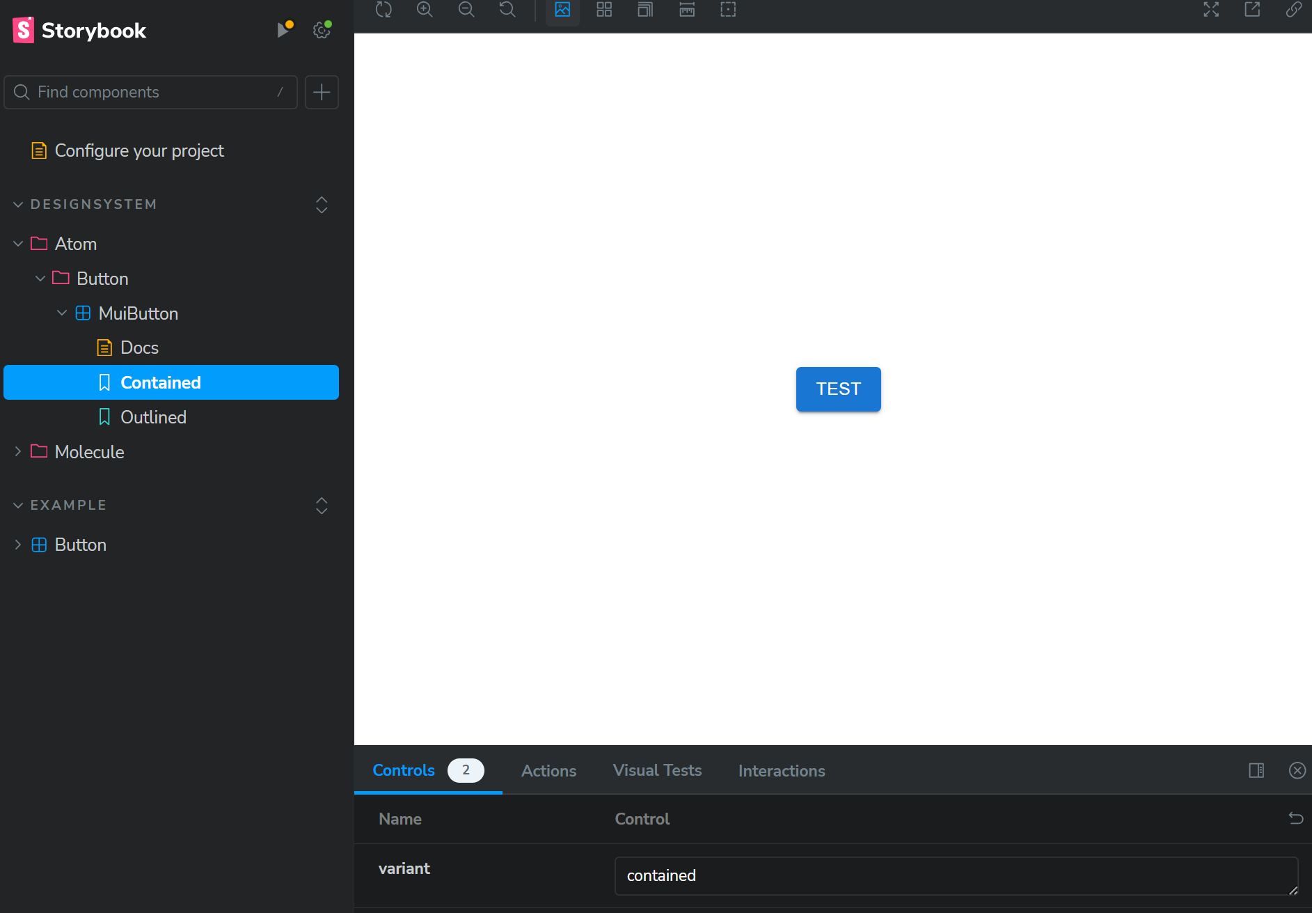
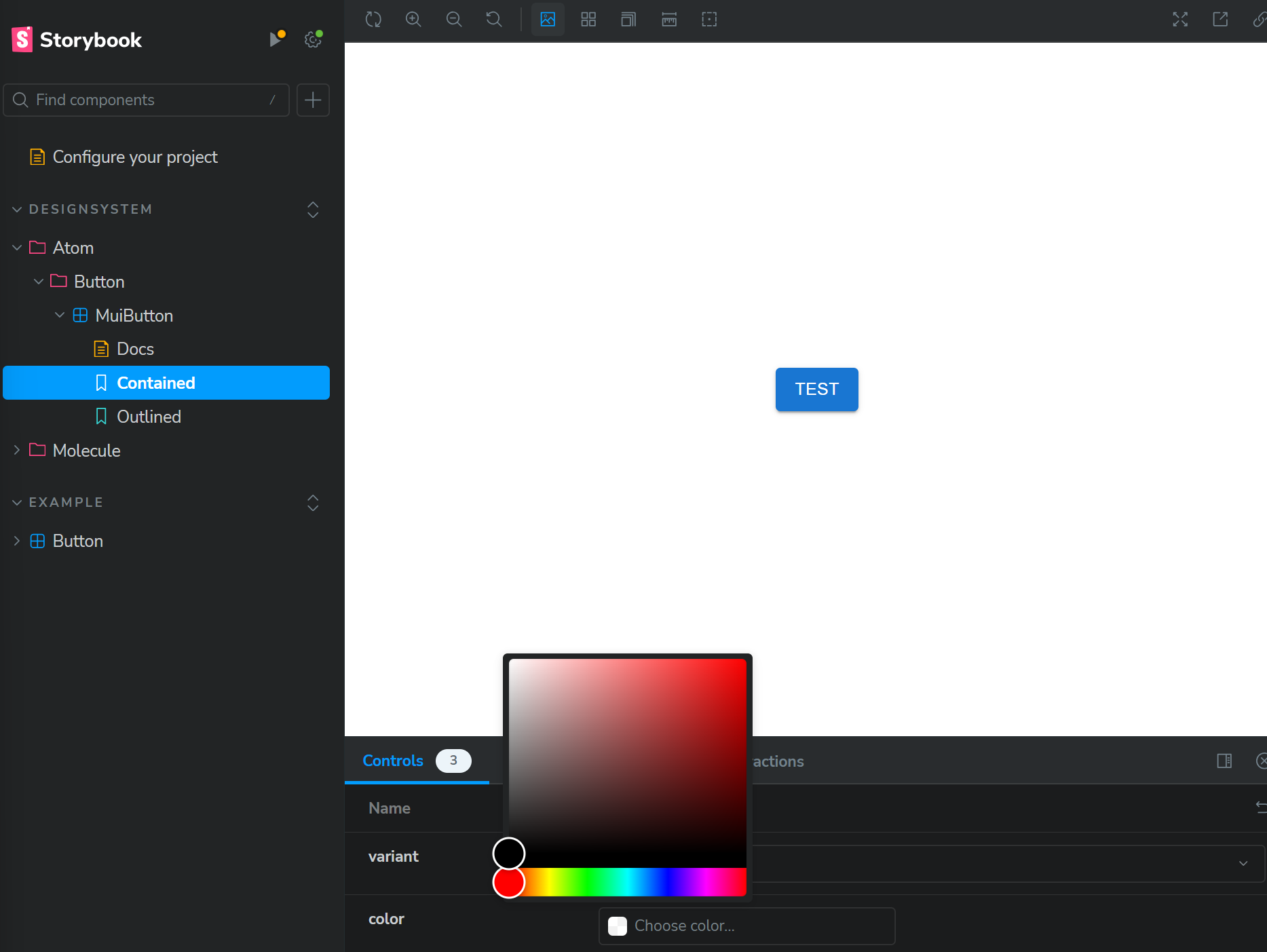
위에서 볼 수 있듯이 props의 type에 따라 storybook에서 control에 default로 설정해주는 input type이 있다. string type의 경우는 text input, boolean type은 switch 그리고 .storybook/preview.ts 파일에 다음과 같이 설정되어 있다면 prop 이름이 background 이거나 color일 때 color picker input이 control으로 적용되고 prop 이름이 date일 땐 date picker input이 control으로 적용된다.
import type { Preview } from "@storybook/react";

const preview: Preview = {
  parameters: {
    ...
    controls: {
      matchers: {
        color: /(background|color)$/i,
        date: /Date$/,
      },
    },
  },
};

export default preview;
아래는 Button compopnent에 color라는 이름의 prop을 추가했을 때 해당 story의 color prop input이 color picker로 설정되는 것을 보여준다.
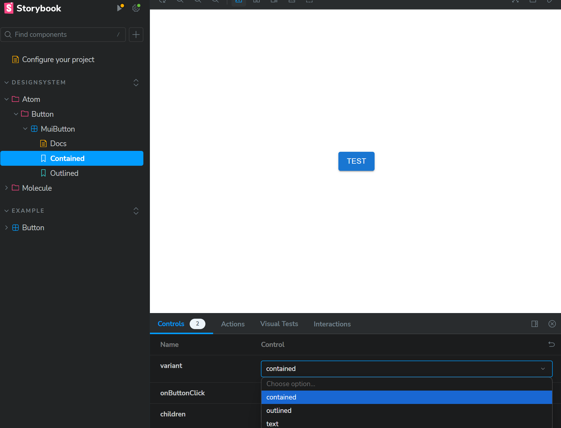
만약 variant control input을 실제로 variant가 전달 받을 수 있는 세 가지 값만 선택할 수 있는 select input으로 변경하고 싶으면 다음과 같이 argTypes.[prop name]의 control과 options property를 통해 설정할 수 있다.
export const Contained: Story = {
  args: {
    variant: "contained",
  },
  argTypes: {
    variant: {
      options: ["contained", "outlined", "text"],
      control: { type: "select" },
    },
  },
};
위의 예제는 variant property를 설정할 수 있는 input을 text input이 아닌 container, outlined, text option에서 선택할 수 있는 select input으로 설정하는 예제다.
Interactions
이전 포스트에서 살펴본 paly function이 story가 render되고 나서 실행될 때 실행되는 과정을 Interactions addon을 통해 확인하고 각 단계를 개별적으로 테스트 해볼 수 있다.
npx storybook@latest init을 통해 stroybook을 install했다면 기본적으로 필요한 addon이 설치되어 있을 테지만 만약 그렇지 않다면 다음 package를 설치하고 설정해준다.
npm install -D @storybook/test @storybook/addon-interactions
그리고 .storybook.main.js 파일에 다음과 같이 설치한 package를 추가해준다.
import type { StorybookConfig } from "@storybook/nextjs";

const config: StorybookConfig = {
  stories: ["../src/**/*.mdx", "../src/**/*.stories.@(js|jsx|mjs|ts|tsx)"],
  addons: [
    ...
    "@storybook/addon-essentials",
    "@storybook/addon-interactions",
  ],
  ...
};
export default config;
addon-interactions을 추가할 때는 addon-essentials ( 또는 addon-actions ) 이후에 추가해줘야 하는 점에 주의하자.
이제 Modal component의 story에 다음과 같은 play function을 추가했다고 가정해보자.
...
import { userEvent, within } from "@storybook/test";


const meta = {
  title: "DesignSystem/Molecule/Modal/BaseModal",
  component: Modal,
  ...
}

...

export const Base: Story = {
  args: {},
  play: async ({ args, canvasElement, step }) => {
    const canvas = within(canvasElement);

    await step("Click Button", async () => {
      await userEvent.click(canvas.getByTestId("open-modal"));
    });

    await step("Input email", async () => {
      await userEvent.type(
        canvas.getByTestId("input-email"),
        "test@example.com"
      );
    });

    await step("Close Button", async () => {
      await userEvent.click(canvas.getByTestId("close-modal"));
    });
  },
};
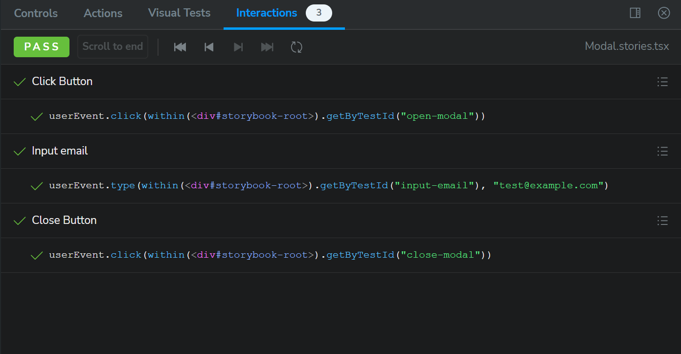
위의 play function은 세 가지 step으로 구성되어 있다. story가 render되면 우선 open button을 통해 modal을 열고 modal의 text input에 test@email.com이라는 text를 기입한다. 그리고 text 기입이 완료되면 close button을 통해 modal을 닫는다.
그리고 storybook에서 해당 story를 확인해보면 story render 이후 위에서 설정한 step이 모두 차례대로 실행되는 것을 확인할 수 있으며 Interactions tab에서도 위에서 실행된 step의 정보를 확인할 수 있다.
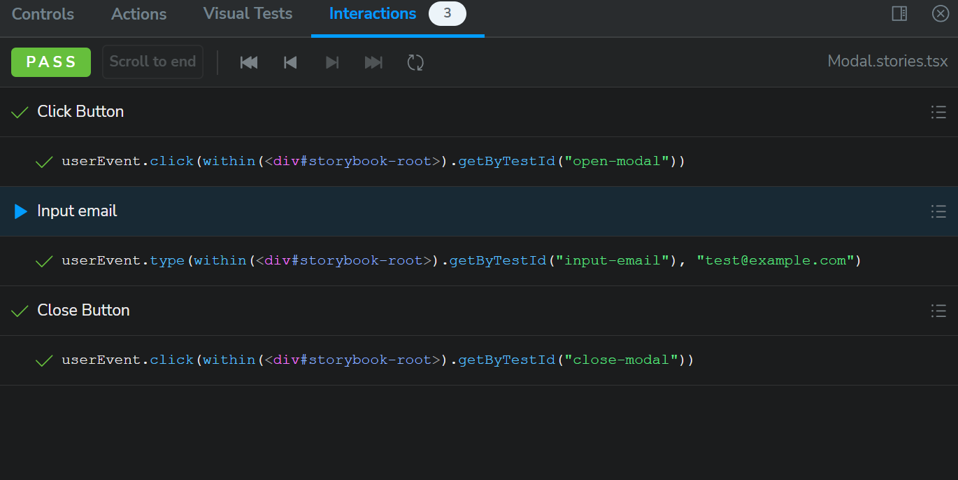
그리고 step에 설정한 title 옆 체크 마크에 마우스를 가져대면 다음과 같이 play button이 생기고 해당 button을 통해 각 step을 개별적으로 실행해볼 수도 있다.
Measure
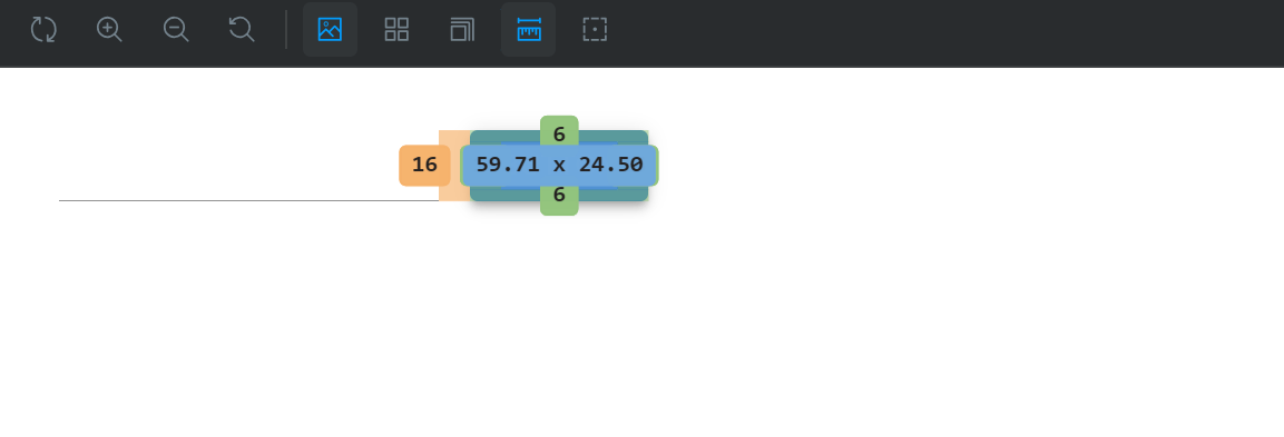
Essential-addons에 포함되어 있는 measure addon을 통해 story에 보이는 component의 padding, margin과 같이 정보를 파악할 수 있다. component story에서 keyboard m을 누르거나 상단의 measure addon을 active 시키고 component에 마우스를 가져대면 component이 padding, margin등의 정보를 확인할 수 있다.
Toolbar
.storybook/preview.ts 파일에서 export되는 preview object에 globalTypes property를 설정하여 custom toolbar를 storybook에 추가하면 필요한 global value를 toolbar를 통해 적용할 수 있다. 예를들어 언어를 선택할 수 있는 toolbar를 추가해야 한다면 다음과 같이 preview object에 globalTypes property를 추가 해준다.
import type { Preview } from "@storybook/react";

const preview: Preview = {
  parameters: {
    nextjs: {
      appDirectory: true,
    },
    controls: {
      matchers: {
        color: /(background|color)$/i,
        date: /Date$/i,
      },
    },
  },
  globalTypes: {
    locale: {
      description: "언어 설정 toolbar",
      toolbar: {
        icon: "globe",
        items: [
          { value: "kr", title: "한국어" },
          { value: "en", title: "English" },
        ],
      },
    },
  },
};

export default preview;
위 처럼 설정하면 아래와 같이 storybook에 toolbar가 하나 추가된 것을 확인할 수 있다.
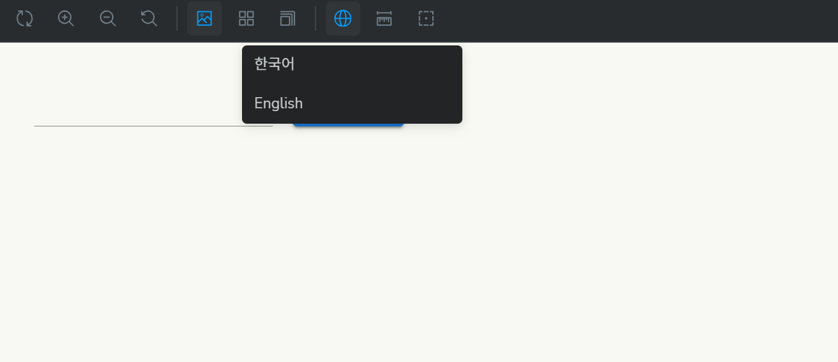
Toolbar에서 선택한 locale value는 story의 decorator나 render를 통해 접근가능하다. 아래는 Story의 render method를 통해 선택된 globals.locale의 정보를 display하는 예제이다.
...

export const SelectedLocale: Story = {
  render: (args, { globals }) => {
    return <div>{globals.locale}</div>;
  },
};
decorator에서는 context param을 통해 globals에 접근할 수 있다.
export const SelectedLocale: Story = {
  decorators: [
    (story, context) => {
      return <p>{context.globals.locale}</p>;
    },
  ],
};
![[ 살펴보기 ] RDB - Relationships](https://cdn.hashnode.com/res/hashnode/image/upload/v1739711556668/48dc9e84-a621-42aa-9c9f-5fc5c436f0ec.jpeg)
![[ 살펴보기 ] MySQL - Data types](https://cdn.hashnode.com/res/hashnode/image/upload/v1739593589113/530f8704-4d27-42c9-a451-bb5c63150b99.jpeg)
![[ 살펴보기 ] TypeORM - Transactions, Migration](https://cdn.hashnode.com/res/hashnode/image/upload/v1739106042581/980b8133-61d4-406a-a026-65be9c28eace.jpeg)
![[ 살펴보기 ] TypeORM - Relations](https://cdn.hashnode.com/res/hashnode/image/upload/v1738666874402/b688bd0b-b6bb-4f43-87d8-c1b46b59f1b7.jpeg)
![[ 살펴보기 ] TypeORM - Basics](https://cdn.hashnode.com/res/hashnode/image/upload/v1738666803591/bef5df17-7dc7-4123-ae55-004d5042df39.jpeg)